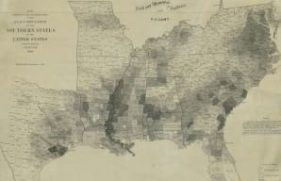
Map Showing the Distribution of the Slave Population of the Southern States of the United States
Civil War and Reconstruction (1850-1877)
A National Archives Foundation educational resource using primary sources from the National Archives

Published By:
Historical Era:
Thinking Skill:
Bloom’s Taxonomy:
Grade Level:
This activity can be used while studying the time period prior to the American Civil War. For grades 5-8. Approximate time needed is 30 minutes.
The focus of this activity is a map created after the 1860 Census. It represents one of the first American attempts to translate census data into a visual representation on a map. It was created in 1861 by the U.S. Coastal Survey using statistical data from the 1860 census.
This activity can be done as a whole class, in small groups, or individually. Students will initially see only a small portion of a larger map with most of the details (including the location, title, and legend) hidden. After analyzing this smaller segment, they will see more of the map, and finally the full map.
When students begin the activity, viewing only a portion of the map at first, they should think about or respond to the questions:
Discuss student answers and inferences as a class. While knowing the full details of the map is not required at this point (in fact, it’s probably preferred that students don’t know those details), students should have a sense of the basic way the data is presented: lighter shaded areas have lower numbers and darker areas have higher numbers. Use probing questions to ensure that students understand this idea.
The next step is to click on the next thumbnail to see more of the map. Using the additional context available (including year, Southern States, etc.) students should respond to:
Discuss student responses and focus particular attention on the purpose of the map and what data students think it displays. After some discussion and hearing possible guesses, click on “View Primary Source Details.” Tell students to zoom into different segments of the map that are now evident, including the full title, legend, Note, and the Census of 1860 box (or do so as a full class demonstration).
In addition, provide the following context:
The map shows the percentage of enslaved people by county, with different colors reflecting the percentage. It provides a visual picture of how enslaved persons were distributed across the Southern States. It was reported to have been a favorite map for President Abraham Lincoln to consult during the Civil War and is depicted in Francis Bicknell Carpenter’s famous painting “First Reading of the Emancipation Proclamation of President Lincoln.”
The last step is to click on “When You’re Done.” Conduct a class discussion based on students’ answers to the following questions:
In this activity, students will analyze a historical map showing percentages of enslaved people by county following the 1860 Census. Students will form an understanding of the distribution of slavery in the southern United States prior to the Civil War.
